
NORTHWEST CROSSFIT
STRATEGY, BRAND IDENTITY, APPAREL, SWAG
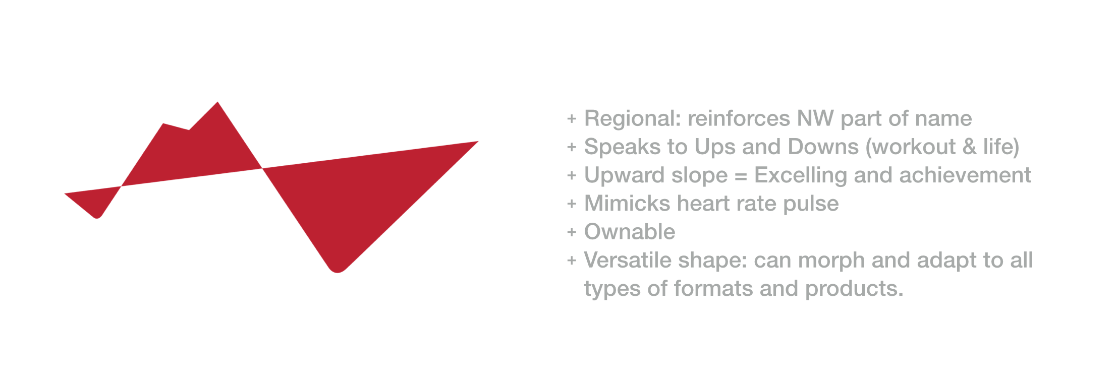
REGIONAL AND RESILIENT. The brand identity we developed for NWCrossFit tells the story of ups and downs people go through, both in work out and life. Additionally, the mountain shape symbolizes the regional aspect and the strong community that exists within all gyms.

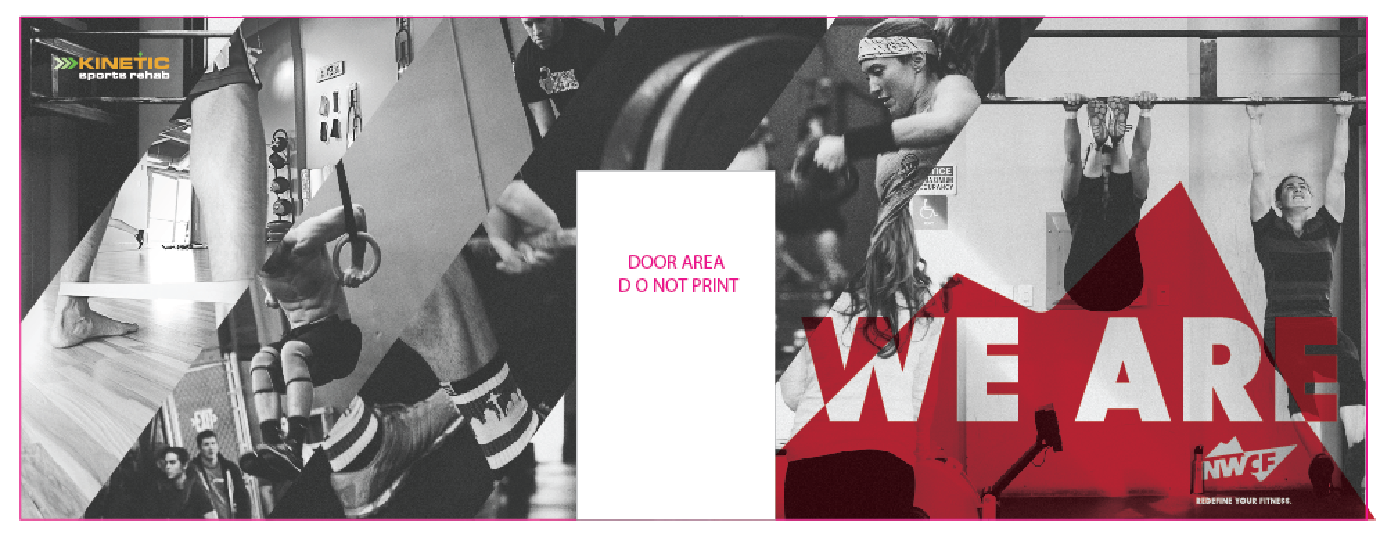
WELCOME WALL: The first thing you see when you walk in the new gym in Seattle. We introduced raw materials like wood and steel throughout the Interbay location.

MANIFESTO: A rally cry for the coaches and members to connect and stand behind.
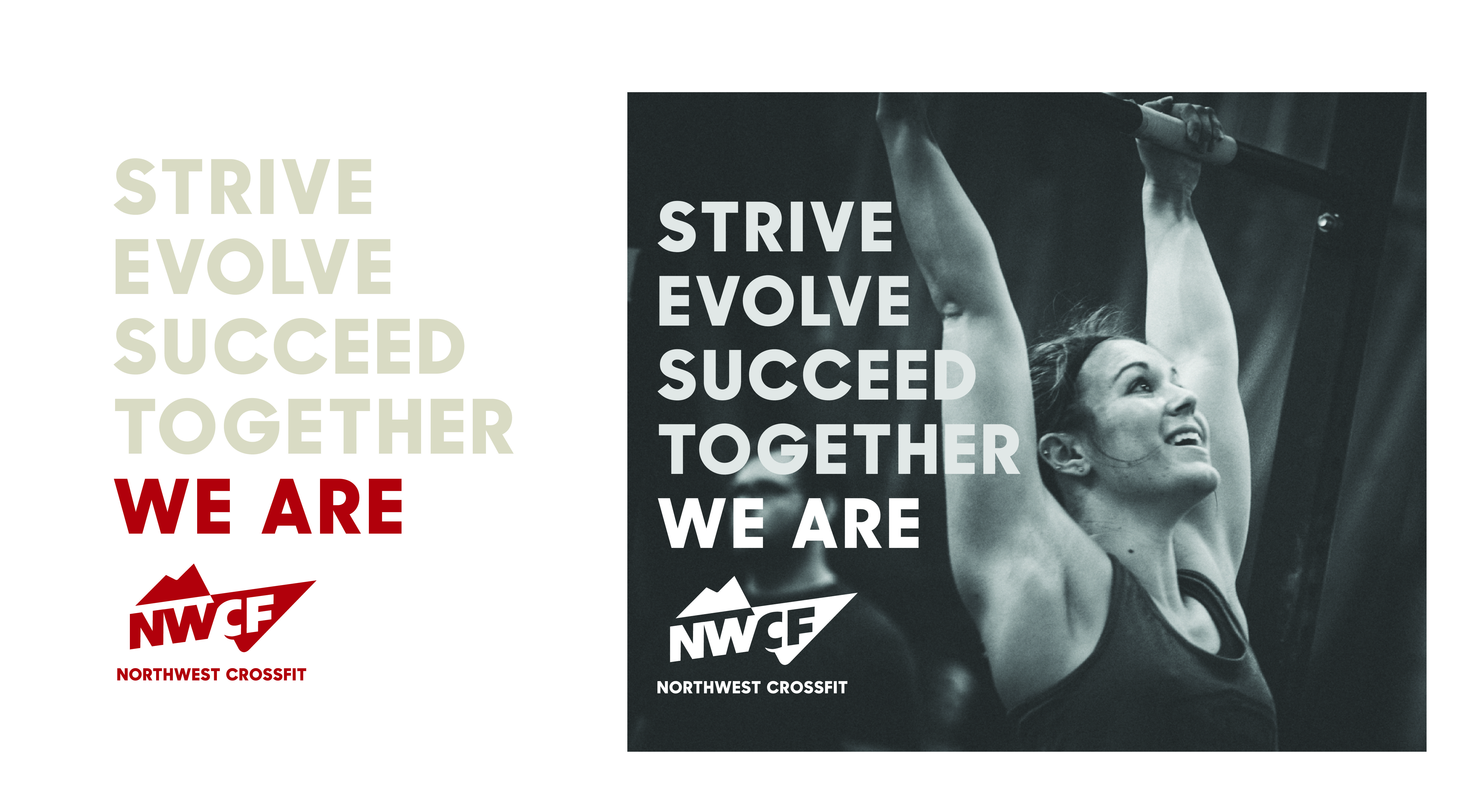
CAMPAIGN GRAPHIC - A symbol to represent the pride and attitude of the people.
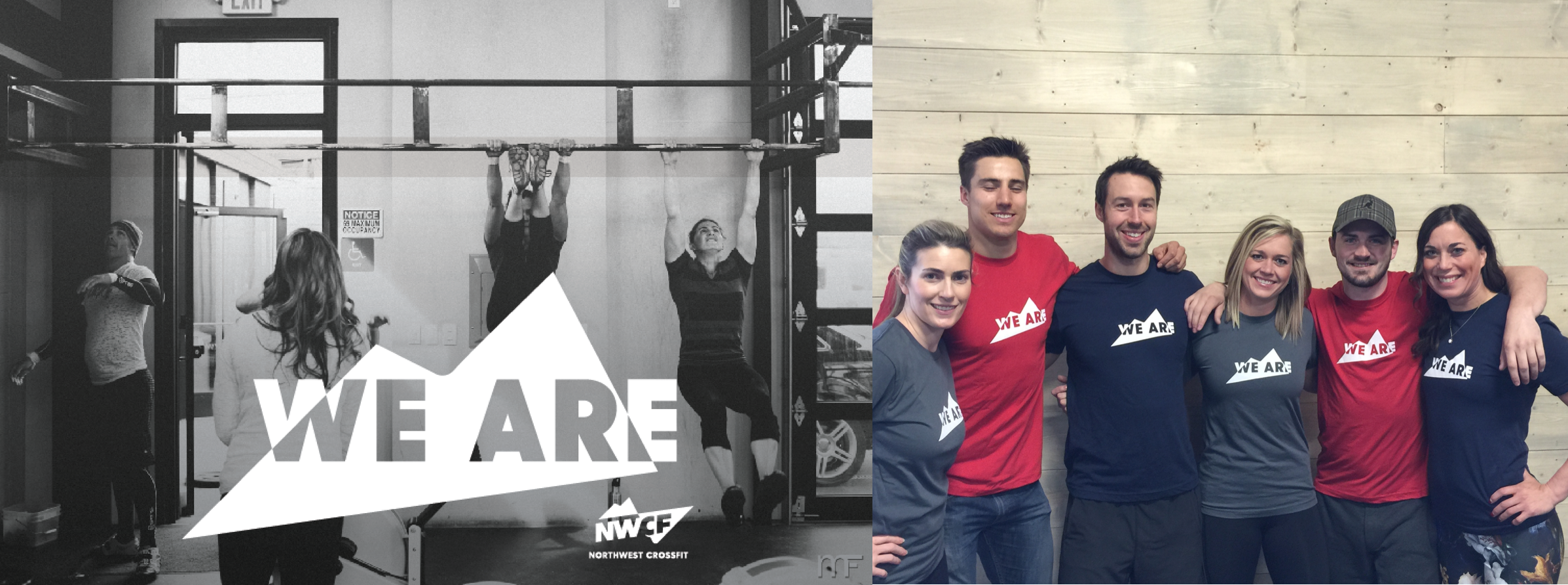

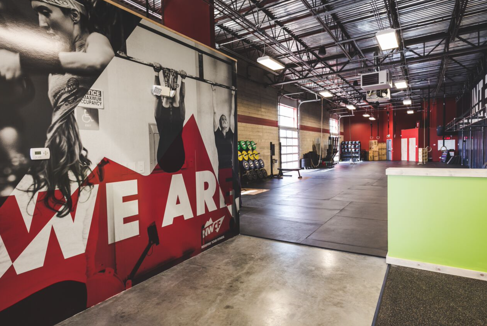
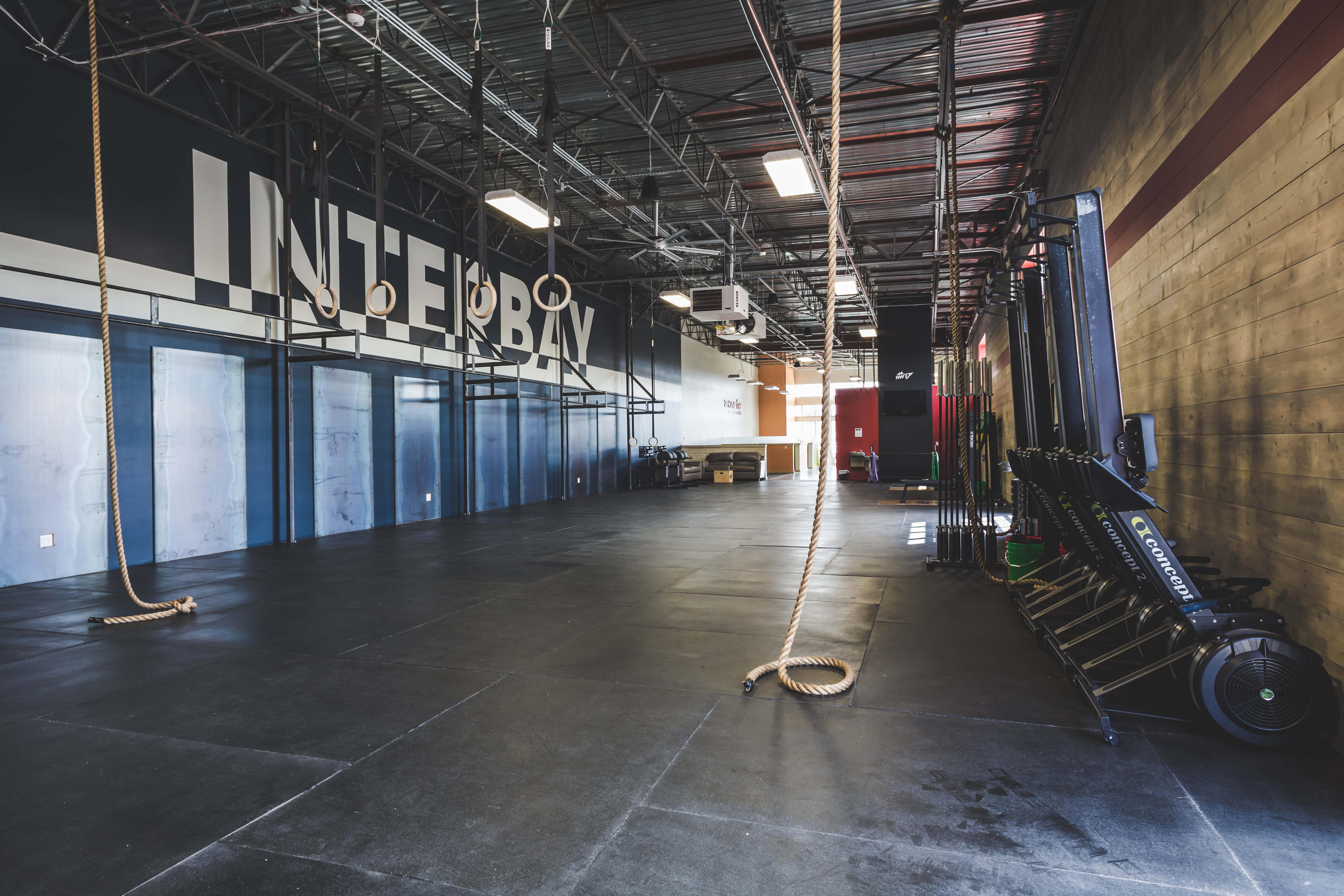
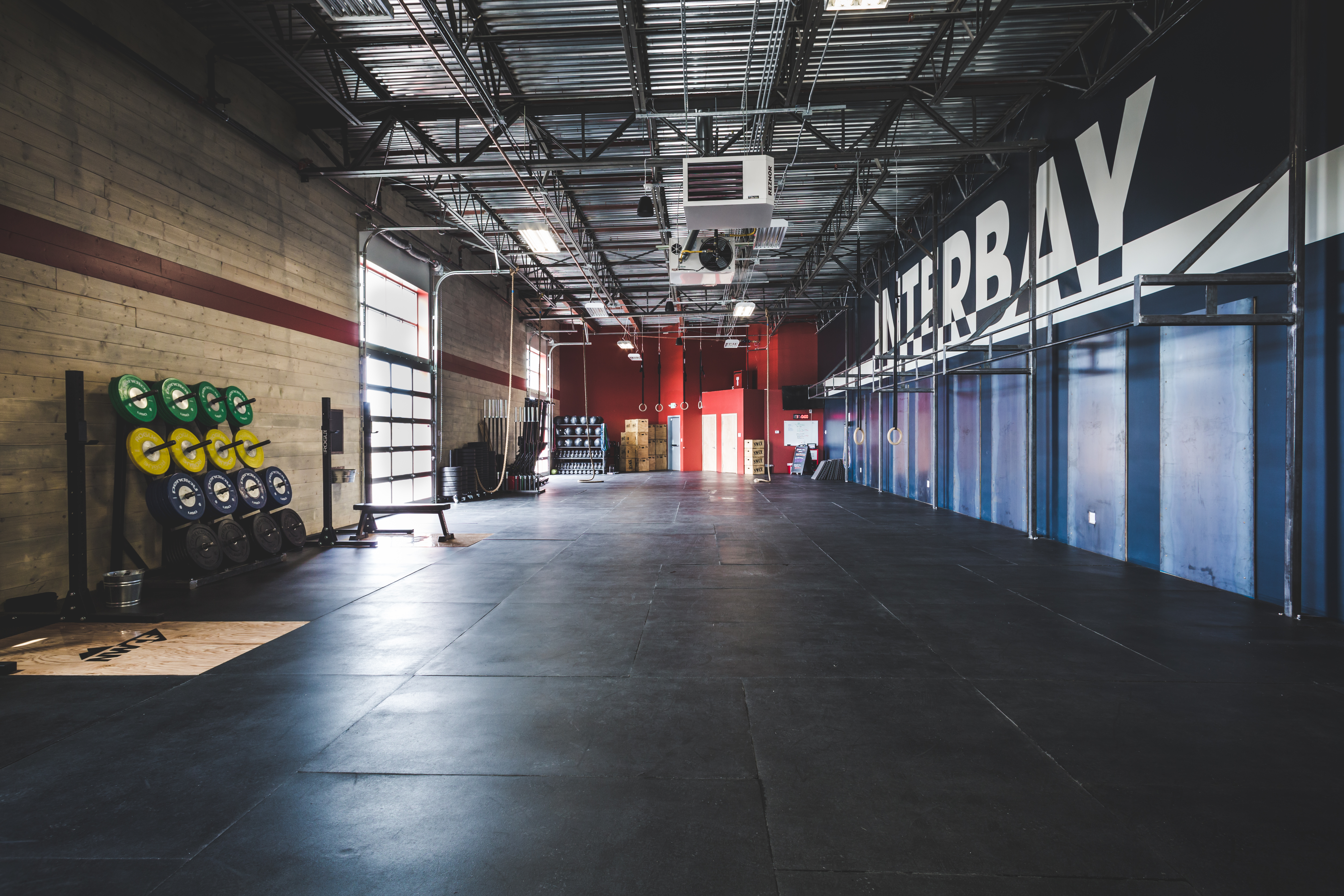
CUSTOM TYPE - Leveraging the pos/neg relationhip that exists in the NWCF brand, we implemented this visual style throughout portions of the business needing the attention, like providing each gym with their own typography.

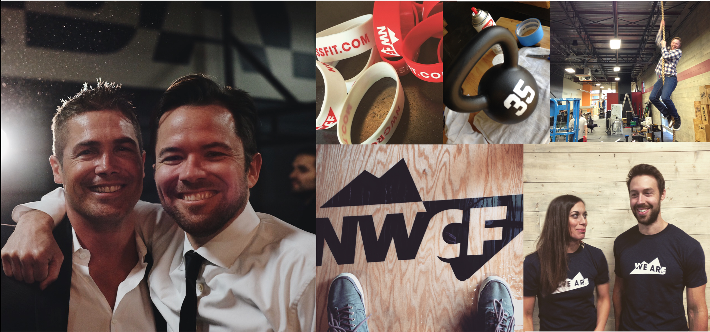
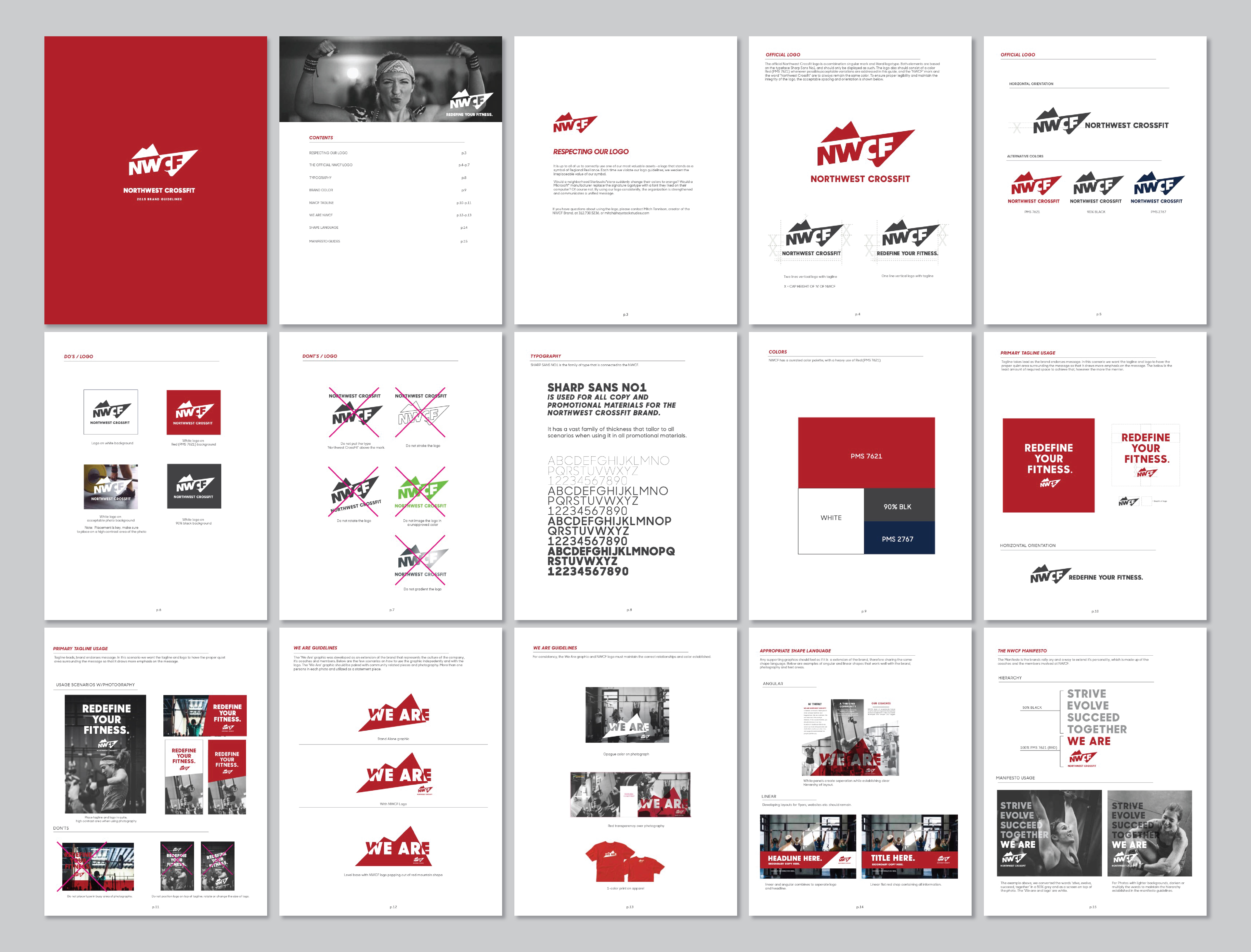
BRAND GUIDES - We developed an extensive deck for the team to understand the in’s and out’s of the new brand.
︎︎︎︎︎︎︎︎︎